Redesigning Spotify Group Sessions
Listening to music should be a fun, simple, and social experience.
UX Research & Design
OVERVIEW
Remote group session is a fun feature on Spotify that allows users to listen to the same music virtually. This feature provides an easy within-app experience for people who want to listen to music as a group and allows its users to access the player panel and the queue. However, starting remote group sessions can be a difficult task. A restructuring of this feature not only made it easier to use but also revealed Spotify users’ desire for greater social interactivity within the app.
TIMELINE
December 2022 - January 2023 2 weeks
TEAM & ROLE
Individual UX Researcher & Designer
TOOLS
Figma, Zoom, GoodNotes, Notion
Pointing Out the Problem
Starting a remote group session is a rather long process. Users don't know where the feature is. They are forced to use third-party platforms to send group session invites. Overall, it’s a clunky experience, and it’s due for some major changes.
Understanding the User
User Survey
To understand how users felt about Spotify and its remote group session feature, I surveyed 13 users. From this survey, I found out that most people knew about Spotify’s remote group session feature.
But, when asked whether they knew how to use the feature, fewer people knew. Still, the feature was a significant aspect of the user’s experience with Spotify in that most people felt that it was a nice-to-have feature.
Current User Flow
Despite most users knowing about the feature, it was surprising to know that some users still didn’t know how to exactly use the feature. This unexpected result led me to draw out a user flow of the feature, so I could analyze potential areas that could cause users confusion and/or frustration.

Devising the Solutions
After conducting user research, I ideated four solutions that would tackle the feature’s problems with low visibility and third-party platforms.
👥
Spotify Friends
Spotify's current social system is a follower system. Users follow each other but have limited social interactions.
Spotify Friends is a new system where users who mutually follow each other can send within-app Group Session invites.
📣
Notifications
Spotify's Notification screen currently focuses on new releases from artists and podcasts that the user follows.
The Notification screen can be used to integrate notifications for Group Session invites from Spotify Friends.
📍
New Location
The Group Session feature is located in the Listening Devices. This location is confusing and defies user expectations.
The feature should have its own dedicated screen, where Group Sessions are handled exclusively.
🔍
Feature Visibility
Since the Group Session feature is located in the Listening Devices screen, the feature currently has low visibility.
A new UI icon should be placed on the player panel, so users instantly knows where to access the feature.
Creating the Blueprint
Redesigning the User Flow
I drafted a user flow to visualize how my solutions would fit into the Spotify interface.
The original user flow limited the user's options to send and receive group session invites. This new flow creates numerous avenues for users to use group sessions.


Wireframing and Prototyping
Using Goodnotes, I created wireframes, outlining the core screens of the remote group session feature on Spotify.
After, I translated the designs into a low-fidelity prototype with interactions.

Testing and Iterating
Low-Fidelity Prototype Testing
I conducted a usability testing with my low-fidelity prototype on 3 users, directing them to do the following tasks.
🕵️
Find the Group Session Feature
Users were asked to find the group session on the new interface.
📤
Send a Group Session Invite
Users were asked to send an invite to a specific friend.
👫
Add a Friend to the Current Session
Users were asked to add another friend to an ongoing group session.
🏃♂️
Leave a Group Session
Users were asked to leave their current group session.
User Feedback and Design Iterations
After the user testing sessions, I made the following changes.
Refined Button UI
Users were confused about which buttons led to within-app and 3rd-party invites.
Specific labels and icons would clear up the confusion.


Onboarding
An onboarding panel would teach users how to use the feature and where to find it.
Users had a difficult time finding the feature's new location.


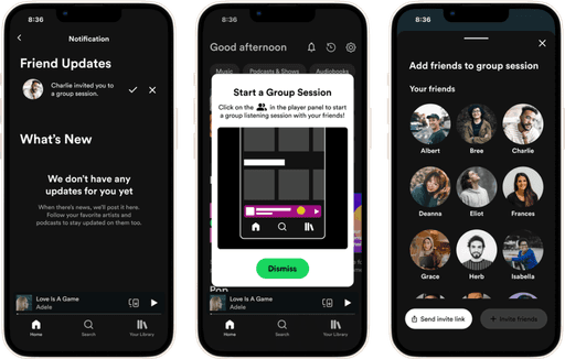
Final Prototype and Testing
I conducted a usability test on 6 users with the final prototype below. Overall, users loved the new redesign, and the design iterations resolved the pain points that previous users experienced!
Final Remarks
Next Steps
Throughout the project, many user research participants mentioned they typically use this feature in the car. A potential next step for this project would be integrating the feature into CarPlay and Android Auto, ensuring safety while still making this feature available.
LESSON
Time Management is Key
I wanted to complete this project within two weeks, and I was successful in that endeavor. However, I realized that planning my daily goals was essential to completing this project within a tight timeframe.
LESSON
The Beauty of UX
This project was borne out of my passion for music and streaming. Through this project, I realized that UX can impact people’s daily lives, and my love for UX design has only grown from this project.